The Ultimate Guide to the New York Times Font: Names, Alternatives, and Web Implementation
 By Sophia Al-Mansoor
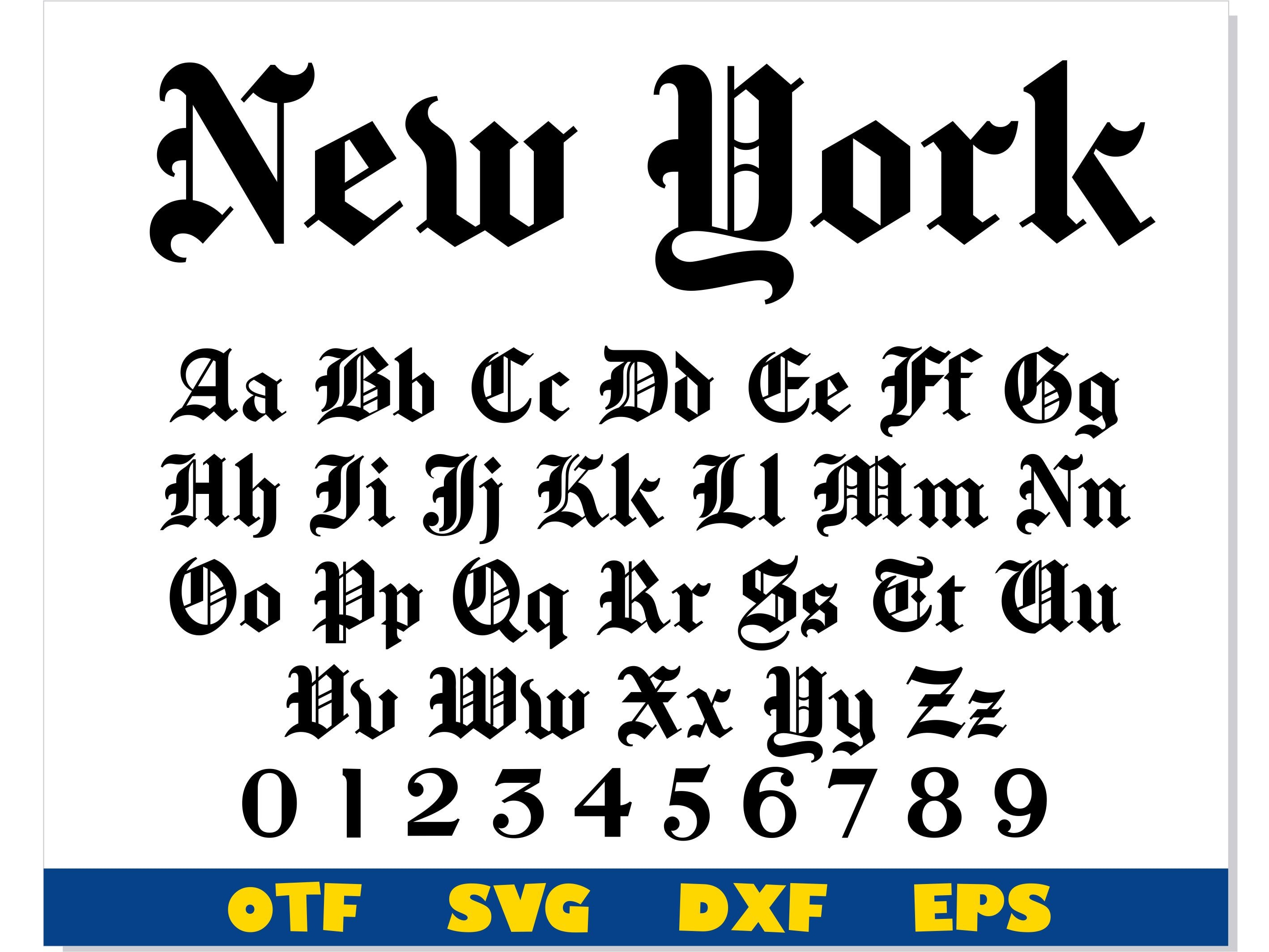
The core text of the physical newspaper has its own technical history. Since 1953, print editions have leaned heavily on the Imperial typeface, engineered by Edwin W. Shaar for the Intertype Corporation. Shaar solved a mechanical crisis: high-speed rotary presses flooded metal type with cheap ink on porous paper, filling in small letter cavities and turning dense paragraphs into unreadable ink blots.
Imperial countered this with wide counters, open apertures, robust brackets, and built-in "ink traps." These features preserved sharp readability under brutal physical constraints.
When the publication made its historic shift to the web, physical ink traps became redundant, but digital rasterization posed new challenges on low-resolution monitors. The paper adopted Georgia font, designed by Matthew Carter in 1993 for Microsoft. Georgia's large x-height and generous character spacing made it the undisputed standard for long-form newspaper body text on the web. As display densities expanded beyond 300 PPI, The Times rolled out NYT Imperial, a proprietary digital reinterpretation engineered specifically for screen rendering.
| Structural Role | Official NYT Family | Historical Era | Primary Free Alternative |
|---|---|---|---|
| Masthead / Logo | Custom Hand-Drawn Blackletter | 1851, 1967 (Benguiat Revision) | Chomsky / Cloister Black |
| Primary Headlines | NYT Cheltenham (Carter Cut) | 1896 (Orig.) / 2003 (Digital Cut) | Playfair Display / Libre Baskerville |
| Print Body Copy | Imperial Typeface | 1953 (Edwin W. Shaar) | EB Garamond / Source Serif 4 |
| Digital Web Copy | NYT Imperial / Georgia | 1993, Present | Georgia (System) / Merriweather |
| Meta & Sans Accents | NYT Franklin (Franklin Gothic) | 1902 (Morris Fuller Benton) | Libre Franklin |
Sophia analyzes international trade, startup ecosystems, retail transformation, and supply chain logistics for modern digital publications.
