The Ultimate Guide to the New York Times Font: Names, Alternatives, and Web Implementation
 By Sophia Al-Mansoor
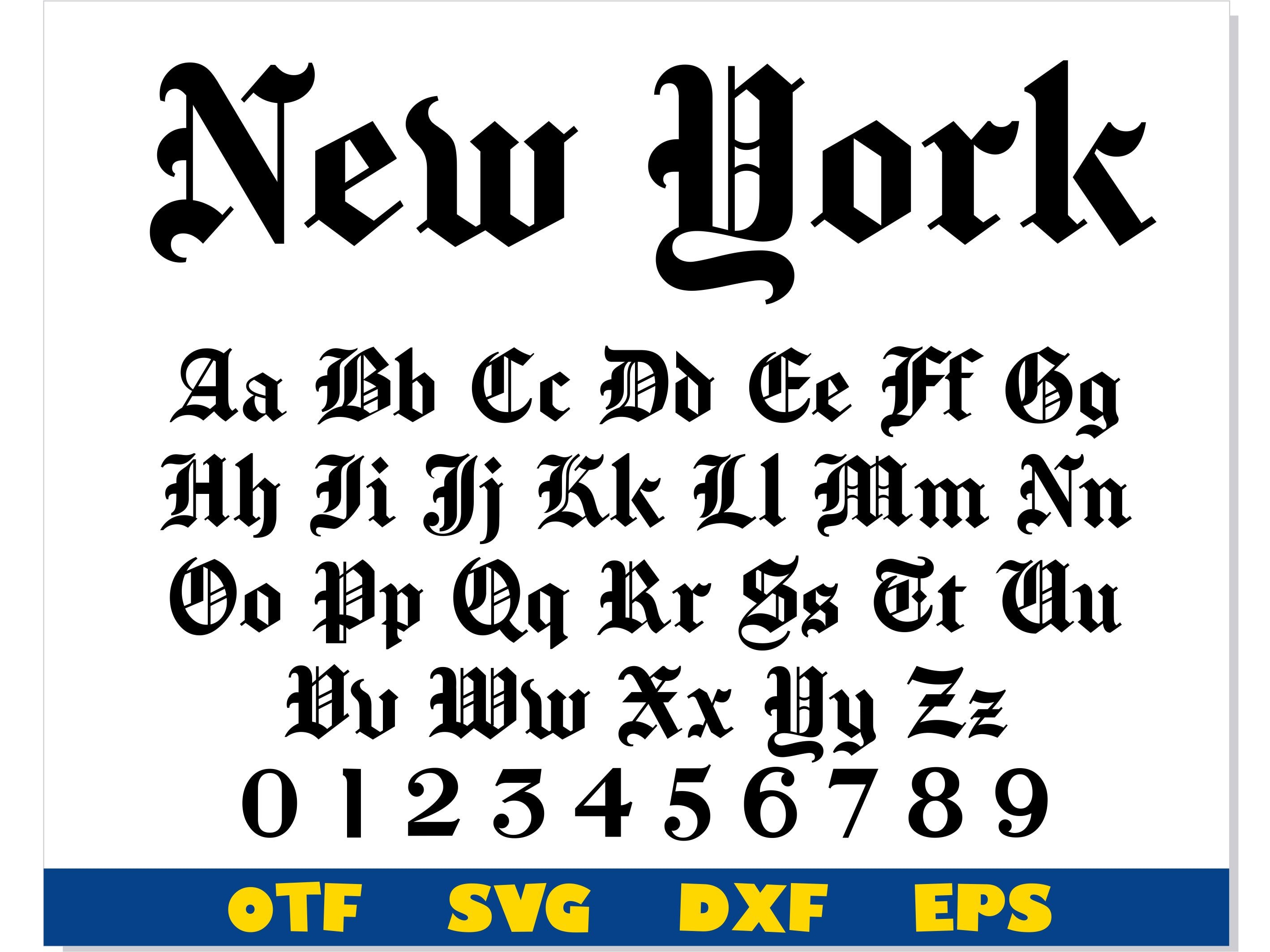
The gothic nameplate that crowns the front page of The New York Times is the most recognizable element of American journalistic branding. It is also the most misunderstood. Web designers hunting for a commercial font file to replicate the header will not find one. The masthead is an insulated visual asset, drawn originally as custom blackletter calligraphy and refined by hand over decades.
In 1967, legendary type designer Edward Benguiat executed the most significant modernization of the nameplate. Benguiat smoothed irregular terminals, removed archaic flourishes, and eliminated the period following the word "Times," which had rested at the end of the title since the nineteenth century. Later, typeface master Matthew Carter provided subtle vector adjustments to balance counter-spaces and line weights for high-speed digital reproduction.
Because the logo is proprietary artwork, graphic designers seeking a typographic equivalent must look to historical Fraktur and Textura cuts. The closest free, open-source interpretation is Chomsky, an open font designed specifically to mirror the paper's blackletter proportions. For commercial projects requiring licensing clarity, Old English Text MT and Cloister Black provide similar structural weights, though they lack the precise optical balance of Benguiat's hand-drawn vector paths.
Sophia analyzes international trade, startup ecosystems, retail transformation, and supply chain logistics for modern digital publications.
